• Subscriptions
  • Advertise
  • Contact Us

Logo

Navigation
  • Home
  • Features
    • Leisure
    • Bites
    • Tourism Market Update
  • Departments
    • Flashback
    • In the Spotlight
    • New to the Community
    • Making Moves
    • Profiles
    • Talking Shop
    • Business Bites
  • Opinion
    • Economic Outlook
    • Island Outlook
    • From the Experts
    • Letters to the Editor
  • Around Town
    • Around Town

Narita Airport launches new brand logo

on March 1, 2017 | Leave a comment
Departments In the Spotlight

20161222-Logo_en

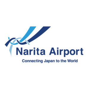
Narita International Airport introduced a new brand logo in December. The logo debuted on the Narita International Airport official website and was incorporated into the lapel pins worn by NAA Group staff on Jan. 1.

The logo features three colors, each with a different symbolism. Indigo represents Japan, blue represents the sky and light blue represents Earth. In addition, the bold indigo line represents a runway and the curved, light blue line represents the flight path of an aircraft to evoke the image of freedom to fly into the future. The lines intertwine to represent the Japanese traditional craft of braiding, or kumihimo.

Share this story:
  • tweet

Recent Posts

  • Pacific pivot

    March 17, 2023 - 0 Comment
  • 2022 Advertisements that Aced

    March 17, 2023 - 0 Comment
  • In The Spotlight – Mar/Apr 2023

    March 17, 2023 - 0 Comment

No Responses to “Narita Airport launches new brand logo”

You must be logged in to post a comment.

  • Popular Posts
  • Pacific pivot

    March 17, 2023 - 0 Comment
  • The Best Policy

    June 3, 2014 - 0 Comment
  • Full tank: Petroleum industry leaders talk strategies

    June 3, 2014 - 0 Comment
  • 2014 Businesswoman of the Year: The Ingenious Shirley Sablan

    June 3, 2014 - 0 Comment
  • Contact Us
  • Privacy Policy
© 2021. All Rights Reserved. Site by Glimpses of Guam.