By Jayne T. Flores

Jayne T. Flores
Assistant director, communications and promotions,
Guam Community College
“Miss, our logo sucks. Can we get a new logo?”
In the seven and a half years that I have been in charge of communications and promotions at Guam Community College, I don’t know how many times I’ve heard that from students. First of all, I would tell them, our logo doesn’t “suck” — it’s just old. Forty years old this year, to be exact.
Back in 2014, when I attended a community college marketing conference on the mainland, one of the presentations centered on acquiring a new logo. I learned two things from the Central Carolina Community College presenters. The first was that a new logo should coincide with a big event — an anniversary, large donation, something like that. The second was that CCCC had paid several hundred thousand dollars to a design and marketing firm to help them develop a new logo, and after a year and a half, they had exhausted the money and still had no product. So they ended up developing their new logo in-house with their visual communications program.
“We have a visual communications program,” I thought to myself. “And it’s a really good one.”
When I returned to Guam, I went into GCC President Mary Okada’s office and pitched to her the idea of developing a new logo for our 40th anniversary in 2017 — a little over two years down the road. “We are going to do this in-house,” I told the president. We had just hired one of our graduates — an amazingly talented young woman, Angela Cabrera. Dr. Okada gave me her blessing, just advising me that it had to be an inclusive project — meaning get everyone on board — students, faculty, staff, administrators, even alumni.
I put together a New Logo Group, comprised of Angela, visual communications and marketing instructors, administrators, staff, some students and myself. (The students kind of wandered in and out of the group, depending on their schedules each semester.) This very zany, extremely creative group of people is what made this project successful. (Our HR administrator would’ve flipped if she had heard some of our lively debates.)
The Logo Group launched the effort in November 2014 with a branding survey that we encouraged students, employees and even alumni to take, trying to get an idea of what GCC represented to them, and what they would like to see in a new logo. During spring semester 2015, we held a logo contest for the GCC community just to get ideas. One of our first decisions was that the new logo could not be a letter because UOG had just released the Big G. We toyed around with several symbols and almost went with a book that looked like a galaide but scratched it at the last minute. We wanted to stay with the GCC letters concept, because people are so used to it. We spent hours looking at company logos and logos from other colleges and universities. We considered symbolism, wanting to include the Chamorro culture in some way, and we wanted the logo to look strong and sustainable (we’re big on sustainability at GCC).
Then one day in January 2016, Wes Gima, another very talented member of our group and a technology wizard at GCC, sent me a video entitled, “What makes a truly great logo?” One of the logo types discussed was the concept of a system — like you see with MTV or Google.
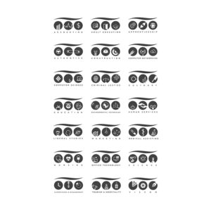
One of the issues we’ve always had at GCC is that every program wants their own logo, and I often have to reign in the errant designers because we can’t have 30 different logos floating around. Once the group saw the system concept, it just took off from there. We spent hours tweaking letters, deciding on colors, and generally driving Angela mad.
“You guys are nuts,” she often told us.
Angela took the lead in designing the main logo and the corresponding system of program logos. We solicited input from programs as to the symbols they wanted in their individual circles. For the main logo, we chose the lighter blue hues to signify our surrounding ocean and sustainability. The G contains a latte stone (kudos to group member Carl Torres), and when you move to the black and white program logos, the wave line becomes a graduation cap.
The genius of the system is that every program has its own unique version of the main logo, yet it is still recognizable as part of GCC. When we revealed the system to students and faculty, they liked the main logo, but it was the system concept that had jaws dropping.
“It blew my mind,” said one member of our student government organization.
One of the things we love about our new logo system is that it symbolizes different things to different people — just as GCC does. Whether you are looking to earn a high school equivalency, an associate degree or certificate, to complete general education courses so you can earn a four-year degree, or for professional development courses, GCC and our new logo system are here for you — with a fresh, unique look that we know will stand the test of time.


No Responses to “GCC’s new logo system — an in-house effort”