
Guam Business Magazine Staff
It takes a lot of effort for designers in marketing to determine what concepts, emotions and colors work well to catch the average consumer’s eye. For 2019’s advertisements, Guam Business Magazine sought insight from the creators of some of the most alluring ads to grace our publication pages.
Putting customers first, the individuals behind the following ads were keen on illustrating the elements that their audience can relate to and empathize with. Here are the ads from 2019 that hit the spot.

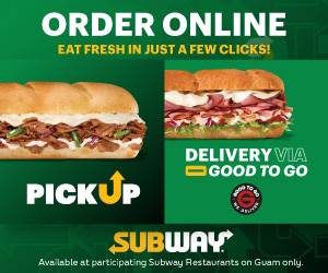
Atkins Kroll Inc. |
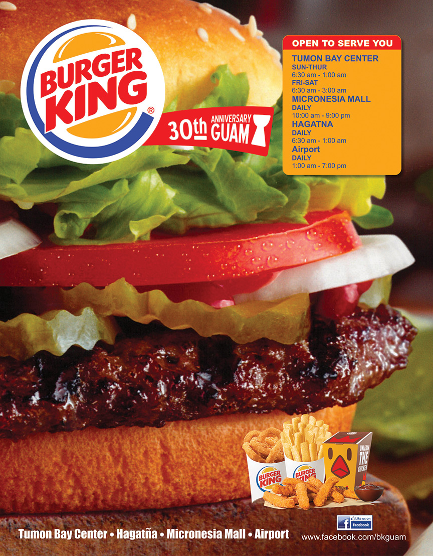
Burger King |
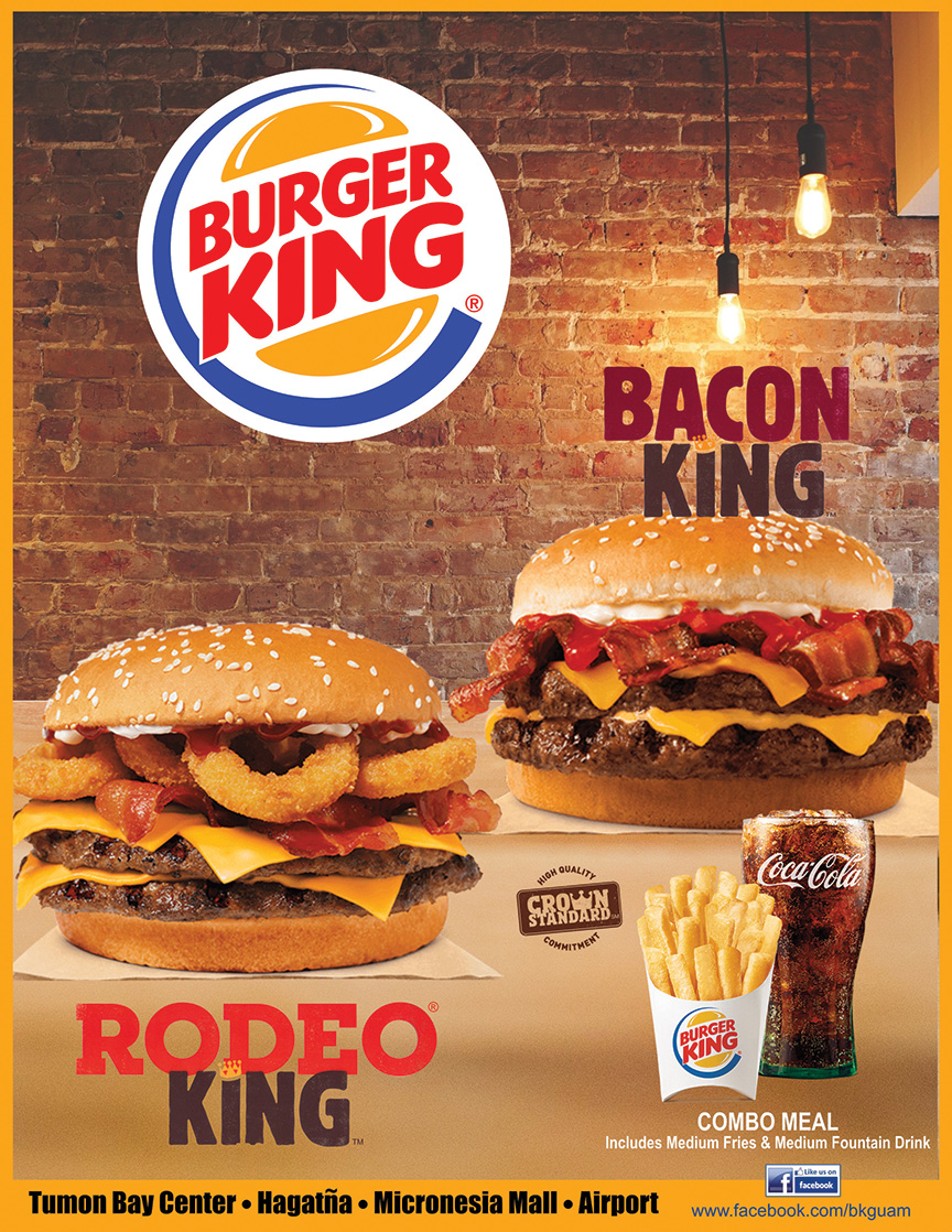
Burger King |

Coast 360 |
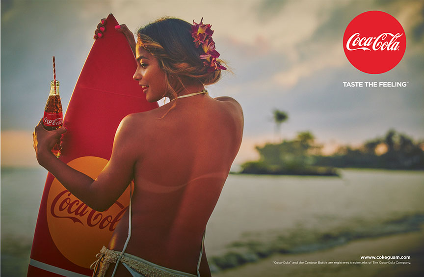
*Coca-Cola |

Docomo Pacific |
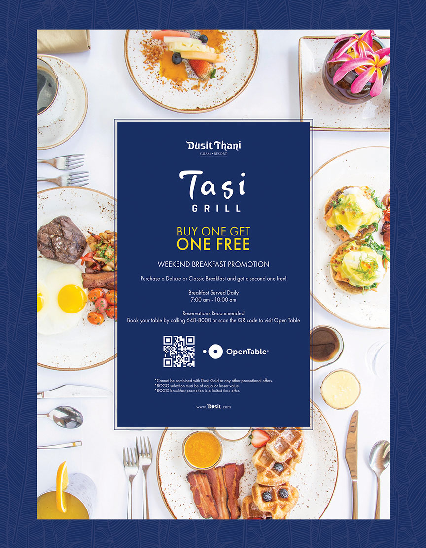
Dusit Thani Guam Resort |

Guahan Insurance |

First Hawaiian Bank |

GTA |
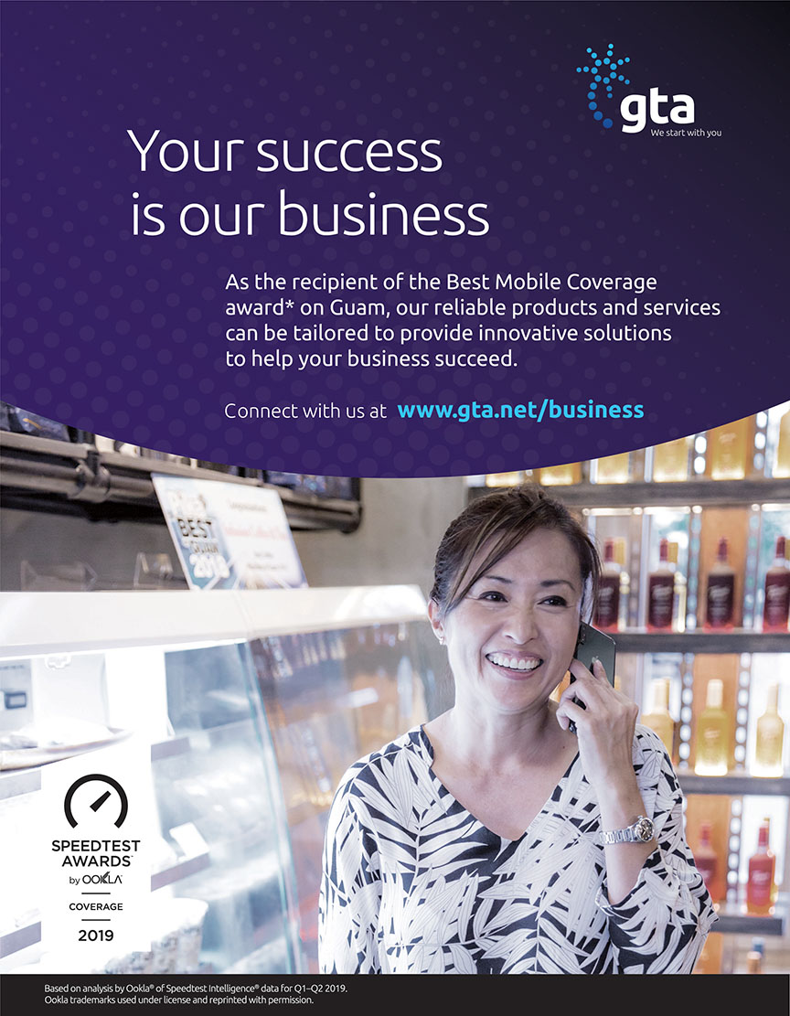
GTA |
GFS |
Matson |
McDonald’s Guam |

Pacifica Insurance |
Outrigger |

SPPC |
SPPC |
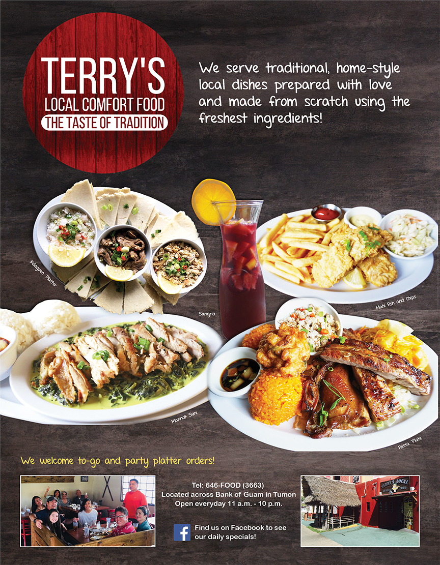
Terry’s |

Titan Imports |
SPPC
Froster
Published in Drive Guam Magazine
Behind the design
Drew Europeo and Benji Bonifacio
Senior designer and Art director, Ideal Advertising
Ideal Advertising has a great mix of Creatives. We have young guns and seasoned vets alike pulling on each other’s hairs and shaking out ideas to make our ads work. For this Froster ad, we had to pull our hairs all the way back to the 1980s.
The Froster logo feels so ‘80s that we decided to just go with it. It’s simple yet in your face. It’s bright and eye catching yet straight to the point. It’s cold and it’s hot. It’s Watermelon Cayenne and Cherry Habanero, and it’s available at Circle K! Apparently, its worthy of Top 20! We’re super glad that it is because “KEEP ON SUCKING” should only apply to the drink.
![]() SPPC
SPPC
Koko Coffee Co.
Published in Buenas Magazine
Behind the design
Drew Europeo and Benji Bonifacio
Senior designer and Art director, Ideal Advertising
It’s been said that when you love what you do, you’ll never work a day in your life. Well it certainly feels like work! But we do love every second of it. We love the creative differences and the eureka moments. We love the tight deadlines and we love beating them. We love learning from defeats and certainly celebrating the victories. We just love the job!
The KOKO Coffee Co. is no exception. We took this product from the ground up and this ad is just one of many that we toiled over. The logo is a nod to Guam’s revered bird – readily identifiable and easily remembered. The ad itself is kept clean and simple. At an instant, you know what it is, you know that it’s available now, and you know where to get it. That’s Ideal.
Pacifica Insurance Underwriters Inc.
Insurance Coverage
Published in Beach Road Magazine
Behind the design
Samantha Sikayun and Charlie Rivera
Marketing coordinator and senior graphic artist
Samantha Sikayun, marketing coordinator at Pacifica Insurance Underwriters Inc., has been working with Pacifica for five years, and in marketing for four of those.
Charlie Rivera, senior graphic artist, has been with Tropical Instant Press for 11 of his 13 years of design experience.

Rivera

Sikayun
According to Sikayun, “The ad says it all — new year, new goals — a fresh start, a new perspective and looking beyond the horizon for better days, better coverage, financial security and assurance.” This ad was published shortly after Super Typhoon Yutu, and the driving force was that, “Despite the destruction and the darkness it brought, even temoporarily, [the islands] could hope for better days.” The ad suggests that during natural calamities, like Yutu, one should upgrade their automobile insurance with typhoon coverage, increased limits for sufficient coverage and other coverage available to ensure one feels safest on the road. “Why the transparent car?” adds Sikayun. “Well, because there’s so much more than what you see on the exterior that matters. Every moving part of your car and everything that isn’t directly a part of it matters every single time you are behind that wheel. So, why not acquire insurance and protect you?”
The duo were hoping to reach individuals who were looking to invest in products that provide financial security. Sikayun believes, specifically in the Mariana Islands, quality advertisements and designs for business are important, and that the ads need to be simple and effective to reach all the residents.